Thursday, October 16, 2008

The Awful Truth about Preference Engines

Jayson Jarmon President,
The Lux Group, Inc.

When you encounter an online preference engine or recommendation system in your daily Internet travels, you may be inclined to scoff, “There’s no way the splendid complexity of my rich, multifaceted personality can be parsed by this generic demographic profiling software.” This is of course in some measure true: how can we say we truly know anyone? How can we hope to ever have a complete understanding of ourselves and others without veering into the philosophic or the metaphysical. Human personalities are a complex pastiche of biology and experience…so much like snowflakes, we are told, that no two are alike.

Enter the preference engine. You know the kind--Amazon.com’s book recommendation system… the ITunes “Genius” system, et al. Engines like these and hundreds of others casually suggest product choices to you based on the preferences and buying habits of others who have chosen this or that product in the past. As the user makes more and more choices, the system hones its recommendations until its insight seems downright eerie in its predictive abilities.

Let’s take William Shatner, for instance. While proudly hovering over my extensive collection of Shatner mp3’s in Itunes the other day (I believe my cursor was on Shatner’s stirring spoken word version of the Beatles’ “Lucy in the Sky with Diamonds”), the ITunes preference engine leapt into action and presented me with the following recommendations:


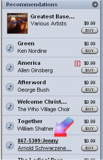
Yes – it’s a version of Tommy TuTone’s 1980’s hit “Jenny (867-5309)” as rendered by bodybuilder/actor/governor Arnold Schwarzenegger.

I was staggered. How could this simple online system deduce from the millions of needs that I might have at that particular time, that I absolutely had to have Arnold singing “867-5309” more than anything else in the world? More than food, more than drink…it was more than a mere physical need: the recommendation would fill the Arnold Schwarzenegger/Tommy TuTuone sized hole in my heart!

An insipid shelf-clearing scheme writ large on the Internet? A crass marketing tool designed to separate the suggestible from their money? A brilliant piece of software that simply reminds us that we are indeed part of a demographic, however obscure and pathetic? The preference engine is all these things, and, ultimately, a mirror into our very souls. Now leave me alone so I can get back to downloading the “Battlestar Gallactica” outtakes that I need so badly right now that it hurts.

Tuesday, October 14, 2008

Clear Design: Icons, part two
by Ben Thompson
Creative Director/VP, The Lux Group

Although the icon is capable of doing a great deal of heavy lifting in an interface, the more complex the action or concept it represents is, the less effective it becomes. Moreover, the designer’s skill in representing and rendering the concept also affects its usefulness.

Let’s use the ‘delete’ function as an example. If your ‘delete’ icon is a button with a big, clear ‘X’ on it, it will work as an excellent indicator of what will happen if you hit that button. Using the program or the website becomes easy—just look for the big ‘X’ to delete a file. Binary concepts like stop and go tend to be the easiest to illustrate, and by extension, the most intuitive to use.

Now say that you work as a designer for the company across the road that makes a competing interface. One spec requirement is a ‘delete’ button, and what could be clearer than a big ‘X’? Nothing, except that your competitor’s product already has a big ‘X’. Moreover, perhaps someone on the marketing team thinks that an ‘X’ is too negative, and suggests a wastebasket. Wastebasket renderings follow…

Icon design is one of those things (like logo design) that look easy, but which challenges the illustration and technical skills of even the best designers. When an icon falls short of indicating its function to the user, it decreases the effectiveness and functionality of the interface. The problem is that with a generation of users who have grown up with GUIs, many people assume that their project needs icon-based controls, rather than a simple and easy to use text-based solution.

Back to our wastebasket—after going through rounds of design revisions (What kind of wastebasket? Wire? Does that look too much like a bucket? What does a bucket mean to the user?) the team has decided that a tiny picture of a wastebasket is not clear enough, and that it will be more clear if a little ‘X’ is included in the corner. Each step that’s been taken from the easily recognizable and easily understood has made it more difficult for the end user to use the interface.

Here’s the upshot—when you depart from words into the realm of concept, you run the risk of compromising clarity. When you’re working with your web designer (or designers, when you’re working with your clients) it’s always worth a moment to ask the stakeholders why an illustrative icon is being used, rather than plain language. In the absence of issues involving translation into other languages, the most effective user design solution can be good old legible text.

As someone who’s spent time art directing designers working on creating a simple icon illustration for a complex concept like “litigation,” I can confidently say that sometimes the client’s design money is better spent elsewhere, and it’s the job of a good web agency to make that known early on in a project.

Tuesday, September 23, 2008

Clear Design: Icons, part one.
by Ben Thompson
Creative Director/VP, The Lux Group

The birth of the graphical user interface (GUI) also spawned the graphic icon. The ground-breaking move away from text-based systems was one of the prime differentiators between the Macintosh operating system and those that had come before it. The next year, Microsoft Windows 1.0 released, followed quickly by Word for Windows 1.0, and there was no looking back to text-based computing.

Icons at that time were 32 pixels square, rendered in no more than the sixteen system colors (when available), and these little darlings made the difference between a drab, workaday interface, and a more inviting, more intuitive work environment. My first icon project was in 1992, while working for Microsoft. The first version of the Microsoft Windows Sound System was being released with a bundled package of sounds, each of which needed a distinctive icon. I had fun putting together the tiny images in flat or isometric perspective showing bells, chimes, saws, and other noisy things. I am compelled to confess that with sixteen years and hundreds of design projects in between me and those icons, my memory has faded, and I’m not clear on what all of them were intended to represent—the jackhammer is clear enough, but the smartly rendered foot coming down on a banana peel is mysterious to me. I’m hoping it was a slide whistle.

Over the years, operating systems, hardware, and information graphics became more sophisticated. Better designers than I am devoted hours to telling stories or giving direction in those 32x32 pixel squares. With each version of the Mac or Windows operating system (with contributions here and there from outliers like NeXTor OS2) the art of the icon got more sophisticated. Then in November 1993, a funny thing happened.

For designers like myself who were internet-savvy (and up until then, that meant working with text-based USENET applications like Telnet, or FTP protocols for transferring files) and who’d worked on multimedia projects for proprietary systems up until then, the ability of a designer to present graphics on the Web opened a world of possibility for online design. Although the neutral gray background was a drawback at first, and the necessity for having text left justified (the ‘center’ tag was a year or two out at that time) was a limitation, a designer could put artwork up, have control over headline fonts, and offer interactivity with a relatively simple bit of coding.
Of course there were other limitations: in 1994, everybody looked at the web through phone line modems of varying slowness. Worse for designers, there were still a lot of really lousy monitors around. Around that time, I remember going in to talk to someone about some freelance work and seeing my online portfolio up on a sixteen-color monitor. All of the lovely continuous-tone scans that I’d included had dithered into the sixteen system colors. Horrifying.

Fortunately, that state of affairs didn’t last long. Paragraph justification options, background colors and photos, frames, tables, streaming media, and cascading style sheets were soon to come, and the graphic web environment has just gotten richer and richer. There’s still one thing that connects contemporary Web design projects to the earliest days of computer interface graphics: the icon.

Part Two to follow…

Monday, September 15, 2008

Lux Pitches in to Prevent Doomsday

Jayson Jarmon
President, The Lux Group, Inc.
As one of the most innovative Internet Development companies in the region, Lux prides itself on finding common sense solutions for its clients. In light of recent developments regarding the creation of microscopic blackholes by the Large Hadron Collider, Lux has taken steps to prevent its employees and contractors from taking similarly threatening actions.

As of today, Lux employees are prohibited from breaking the laws of thermodynamics in the office. Please see notice below, posted in the Lux facility. We hope other businesses follow our example and help keep the solar system safe!


Wednesday, September 10, 2008

BANG! Just kidding.


We at Lux congratulate the scientists from the CERN Particle Physics center in Europe for successfully erecting the Large Hadron Collider. At a cost of ten billion dollars, the LHC represents the most expensive and most ambitious attempt that mankind has made to peer into the origins and mechanisms of the universe. Over the next few years, look forward to a series of barely-comprehensible, yet fascinating stories to be dumbed-down and reported to us as a human interest story by astonished-sounding local news anchors.
People being people, though, not everyone is happy about this new peek at the fabric of reality. A contingent of The Concerned has become more and more vocal, insisting that this will lead to the end of the world. The naysayers are an interesting mix of folks—the usual handful of contrarian scientists who gather a bit of the spotlight by providing ‘opposing viewpoints,’ has been amplified by the Easily Scared…the same folks who have basements full of eight year old MREs left over from when the world ended on January 1, 2000.
Mix those folks in with the anti-science contingent (I’m talking to YOU, Kansas, and to YOU, Florida) and you get a vocal bunch of torch-bearing villagers who are up in arms about the “European Time Machine” and its attempts to unravel the mysteries of the Big Bang.
Will The Concerned and the Easily Scared stop the Large Hadron Collider? It’s doubtful. Are they right that it could spell the end of the universe (as we know it)? Also doubtful. Just in case, though, It’s probably a good idea to check in from time to time with a fantastically useful site, “Has the Large Hadron Collider Destroyed the World Yet?

Ben Thompson 9.10.08

Thursday, May 8, 2008

Practical Information Architecture on the English Model

Jayson Jarmon
President, The Lux Group, Inc.

When one needs to move millions of workers each day through a complex system of underground tunnels and train stations, information management, signage, and practical design are essential to prevent chaos and confusion. The well-known map of the London Underground transport system is an iconic touch point in brilliant, usable design. Regardless of language, level of experience, or familiarity with public transport, millions upon millions of users of the London underground can instantly understand and follow the maps, getting where they need to go even if they are relatively unfamiliar with the city and outlying suburbs.

When Microsoft asked Lux to design a poster for the Office System Developer's Conference 2008...one that had 7 different tracks variously intersecting 82 different course modules, well we borrowed an old time-honored model from the London Underground:


Microsoft Office System Developer's Conference 2008 Tube Map

Saturday, May 3, 2008

An Honest-to-Goodness Waterloo Sunset

Jayson Jarmon
President, The Lux Group, Inc.

Not Your Great, Great, Great-Grandfather's London

Jayson Jarmon
President, The Lux Group, Inc.

While visiting old friends at Think London (London’s official foreign direct investment agency), we had an opportunity to talk about the Capital’s economic growth and prospects, the rapidly approaching 2012 Olympic games, and the transformation of London itself as it progresses further into the 21st Century.

Think London has updated its HQ since we last met and have moved into London’s Canary Wharf area. To those who don’t know London, it’s a vast organic place with few buildings over 10 stories—the city grew over the centuries along ancient roads and byways. Canary Wharf, built east of the city in abandoned docklands in the late nineties, seems more like an American city with enormous skyscrapers and even a grid-based street system.


A Canary Wharf Skyscraper

Think London has a beautiful view up the Thames to the west, and you can see the cataracts of the river all the way to Westminster.

Here we see Lux Creative Director Ben Thompson enjoying the view:


Who let this guy in?

Thursday, May 1, 2008

I Sing the Body Electric

Jayson Jarmon
President, The Lux Group, Inc.

Elsewhere on this blog I have made the case that “everything that can be digital, will digital”—perhaps this is even true of automobiles (well, if not digital, then electric at least). In the US, we pat ourselves on our backs over our hybrids and think we’re all that. In London tonight I saw some real thought leadership. Across from the Lyceum Theater near the Waterloo Bridge, I saw my first electric car at an “electrobay recharging site.” What appears at first to be a parking meter, is actually a plug and extension cord for recharging electric vehicles.


Hybrid? Schymbrid!


Clean, precise, efficient work with a nod to futurism in that little green light. Sounds like the essence of London design to me.

Tuesday, April 29, 2008

Blog-Archy in the UK

Jayson Jarmon
President, The Lux Group, Inc.


See, they even named a street after me!

13 years is a long time, and in Internet years it's a really long time. We've worked with multiple partners in the UK since 1995 when I was the original project manager for the BP corporate site, and I dearly love getting the opportunity to touch base in a city that is arguable darker and rainier than Seattle (somebody will have to consult Wikipedia on that). So, whenever we're in London it's fun to get a sense of what's going on in the design and development world (and the pub world, but that's an entirely different story).

So, this week Lux Creative Director Ben Thompson and I are off to the UK once again talking to folks about interactive development projects, and we'll be blogging from London and its environs on an irregular basis. We'll post photos, talk to designers, and see what's hot in London during the rainy month of May. Who knows, we may even get a glimpse of Ben's band onstage in Soho.

Monday, March 24, 2008

Nerd Alert!

Are you fond of retro-futurism? Each generation envisions the future a little differently than its predecessor. Jules Verne foresaw spaceships to the moon, Arthur C. Clarke imagined communion with higher intelligences. Even Hanna -Barbera envisioned a world of space needles and robots called The Jetsons. In time, these predictive fantasies are overtaken by history, encased in amber like the mosquitoes in Jurassic Park. They seem quaint.


Whole Lotta Rosie

The science fiction of each generation says more about contemporary thinking than any real future of course. Fritz Lang's Metropolis was more about class warfare and anxiety over the rise of fascism than it was about the distant future...the double-feature space monster movies of the 50's were always more about Cold War anxieties than the giant ants...don't even get me started about Starship Troopers.

As I was riding to work today on the retro-futuristic monorail, approaching the retro-futuristic Space Needle, I started thinking about computers and how predictive (or not) the sci-fi dreamers have been.

What does retro-futurism tell us about computers? Did anyone predict distributed computer networks, the World Wide Web, or the Internet? I don't think so -- generally, computers in science fiction come in three flavors:
  • Super Computers that Threaten our Liberty (Colossus: The Forbin Project, I Robot, Tron, The Matrix)

  • Defense Computers Run Amok that Threaten our Extinction (War Games, The Terminator)

  • Cold, Disembodied Intelligences Rivaling or Superior to Humans (2001: a Space Odyssey, Hitchhiker’s Guide to the Galaxy)

I cannot think of a single piece of science fiction that predicted microcomputers, distributed computing, or the digital revolution. Perhaps that's because the digital revolution is so unique and democratizing, that it failed to elicit the angst of the apocalyptic sci-fi visionaries.

So let this stand as a challenge: if you know of any well-known retro-futurist or science fiction writer who predicted the Internet please send me a mail that I might stand corrected.

jaysonj@luxworldwide.com